By Maria Cristina Didero
Just like the concept of “home” transcends the material idea of the house, the first comprehensive museum exhibition by Snarkitecture, is more than an interactive retrospective: Fun House, which extends over the much of the Museum’s historic Great Hall, embodies ten years of creative work by the New York–based practice. Snarkitecture’s signature touch operates on the edge between art and architecture by playfully exploring the nature of materials, everyday objects and environments. Shifting codes and breaking theoretical rules is the core of the collaborative studio, founded in 2008 by Alex Mustonen and Daniel Arsham, and joined by partner Benjamin Porto in 2014.
Download a printer-friendly version of the Fun House guide.
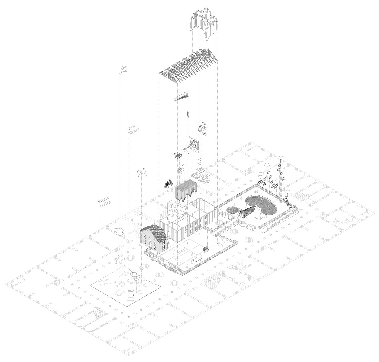
To celebrate their first decade of adventures, Snarkitecture took on a new challenge: to build their first house. Full–size and complete, but not real, this “fun house” hosts a selection of their most visionary past works, as well as new projects created specifically for this occasion. At first glance Fun House looks like an iconic suburban house, complete with front–yard and backyard, a playground for kids, and a pool, but when visitors come closer they soon realize that nothing is as it seems. Snarkitecture’s artistic skill has already started working its magic by a single simple gesture: the absence of color. Everything, from the ground to the roof, from the walls of the house to the pool, is painted white—the signature look of this peculiar firm’s work—representing an open window, a limitless world of possibilities, letting each viewer fully experience and interpret a personal set of meanings and reactions.
A custom recreation of Snarkitecture’s iconic A Memorial Bowing (2012), originally created to commemorate the Miami Orange Bowl Stadium, will welcome visitors into this peculiar “public property” from the front–yard. Instead of a conventional door, visitors will enter the house through an excavated hole in the facade, a tribute to Dig (2011) a project first executed in New York in 2011. Guests can let themselves wander in the house and start a journey reminiscent of Goldilocks and The Three Bears; they can stroll around, exploring and temporarily inhabiting every corner of this uncommonly common household, experiencing environments and objects that provoke wonder. Although it has no residents, this house does have an owner: it belongs to Snarkitecture, therefore their unique take inhabits every room in the form of visionary ideas and assignments. By entering Fun House, guests become part of a world where time and space can’t be defined, and where fantasy and reality coexist. The journey through the interiors is intended to be emotional, not just physical : each room plays on the familiar layout and themes of the iconic American home—kitchen, bathroom, attic, and even a back yard, complete with a pool. Each space creates new meanings through word–play, double–take, surprise, wonder, disbelief, games between surface and excavation, strangers and guests, mirroring concepts, technics and tactics—all of which are part of Snarkitecture’s creative language. The constant change of scenery within the different quarters conveys the intriguing plot of this collective studio as a series of episodes, displaying technique and creativity, while underlining the strength and consistency of their methodology to the limitless universe of architecture and inspiration. At the end of this journey guests exit the house towards the East Court, or “backyard,” greeted by Playhouse (2017), a kidney–shaped pool filled with hundreds of thousands of recyclable plastic balls, reminiscent of The BEACH—initially commissioned by the National Building Museum for Snarkitecture’s first project for the Summer Block Party 2015.
Snarkitecture’s artistic process follows a straightforward approach in three steps: observing reality through unusual lenses, reformulating it through a peculiar set of filters, and finally delivering an original outcome, shifting our beliefs about the familiar and unfamiliar. With this conceptual perspective on singular experiences, Snarkitecture creates unexpected and memorable flashes, inviting people to explore and engage with their surroundings through Snarkitecture’s eyes. Snarkitecture creates its own universe through a dense and lucid design process, augmented by constant research of balance, , encapsulating layers of various meanings within a vivid setting. “Fun House,” say the architects themselves, “represents a unique opportunity for us to bring together a number of different Snarkitecture–designed interiors, installations, and objects into a single, immersive experience.” With over 40 objects and installations spread throughout eleven different spaces, Fun House aims to make architecture accessible to a wide and diverse audience, inviting people to discover this unpredictable universe and play with it.
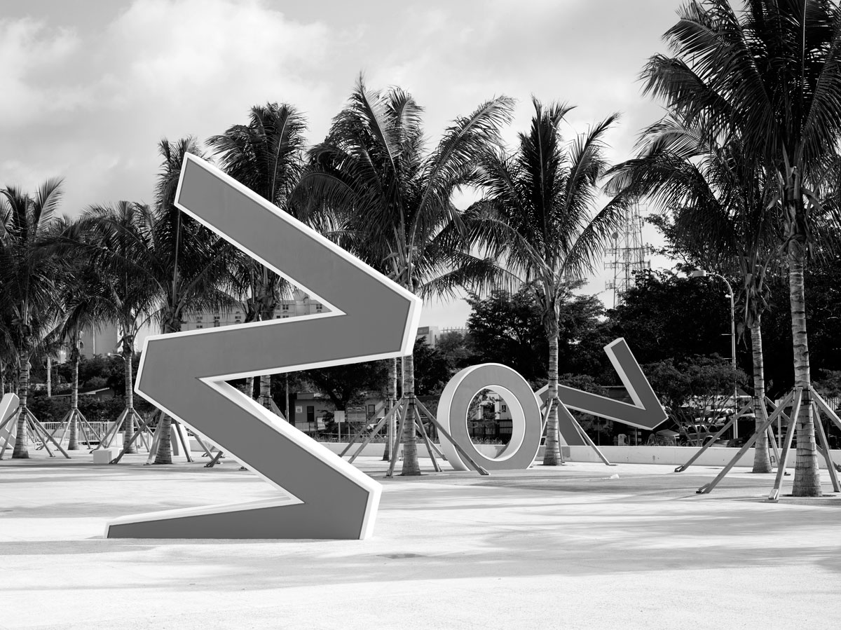
A MEMORIAL BOWING | Miami, FL | 2012
Fun House includes a reinterpretation of A Memorial Bowing, a public artwork commissioned by Miami-Dade County Art in Public Places for Marlins Ballpark in Miami, Florida. The original project commemorates the former Orange Bowl Stadium by reconstructing the letters from the stadium’s iconic MIAMI ORANGE BOWL sign in reinforced concrete. Reimagined for the National Building Museum, the FUN HOUSE letters are made of soft upholstery offering both signage and seating.
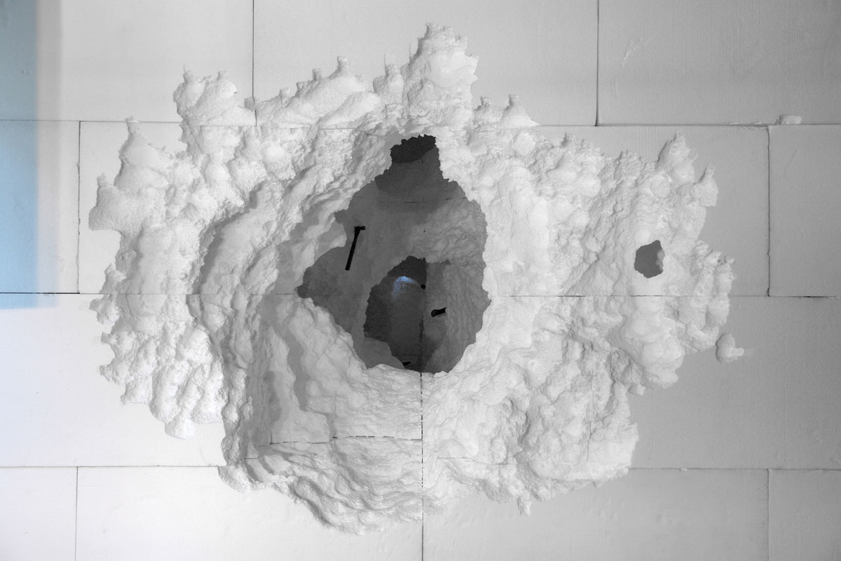
DIG | New York, NY | 2011
Originally commissioned by Storefront for Art and Architecture, Dig explores the architecture of excavation. Once inside Fun House, visitors encounter a facade that dissolves into the cavernous volume of the foyer. Infilled solid with EPS architectural foam, Dig is created by carving voids into the mass using simple tools and primitive techniques—hammers, picks and chisels. The EPS foam material will be returned to the manufacturer and recycled at the close of the exhibition.
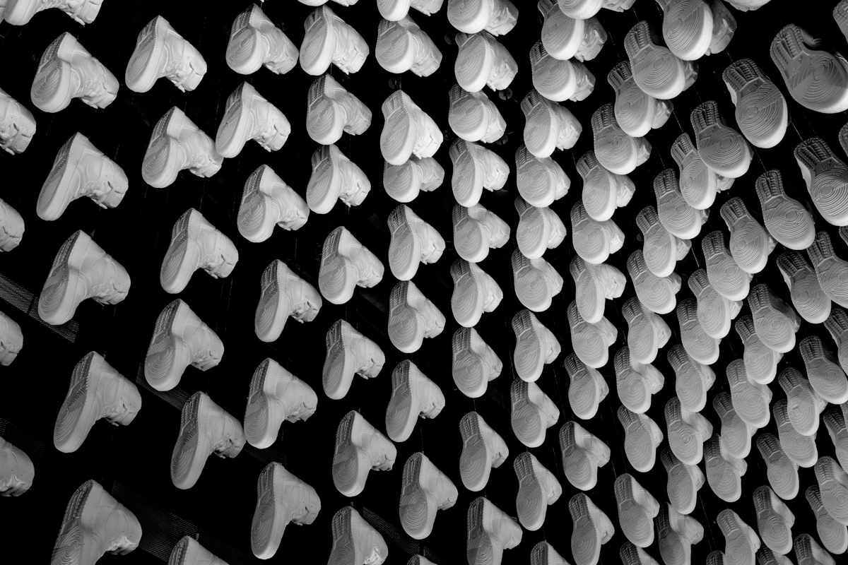
KITH | New York, NY | 2014
In an ongoing series of retail spaces for the footwear and apparel brand Kith, each store is centered around a custom installation of cast Air Jordan sneakers. From the Air Jordan 1 (1985) used in the original New York store, to the Air Jordan 6 (1991), each store has featured a different cast version of the shoe. Crafted with the detail and nuance of the original sneaker, but rendered in a single material and color, the cast replicas create an uncanny effect.
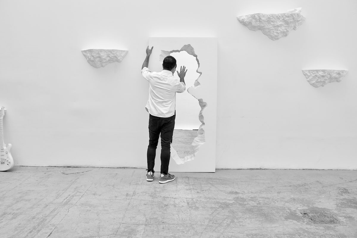
BROKEN MIRROR | 2017
Broken Mirror was created in collaboration with Italian design company Gufram. The design sets up a playful contrast between the technical precision of the glass mirror and the unexpected softness of Gufram’s signature Guflac foam material. The resulting limited edition piece is both familiar and strange—an architectural fragment that reflects the shared sensibilities of Gufram and Snarkitecture.
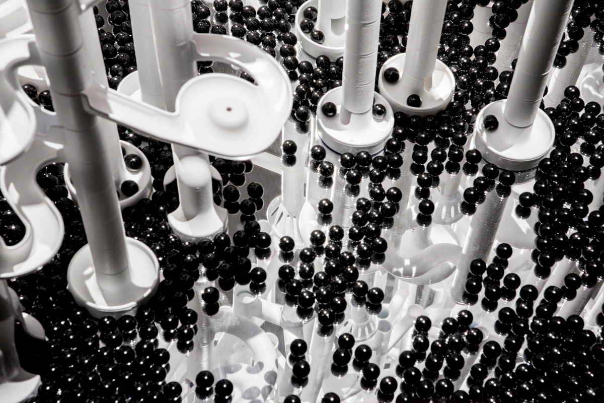
MARBLE RUN | Miami, FL | 2015
Marble Run is based on the classic children’s toy, but reimagined as a monochromatic, sculptural piece. The exaggerated scale and reduced color palette counteract the playfulness often associated with this familiar object. Visitors are encouraged to interact with the piece by depositing glass marbles into the structure. The marbles descend in unpredictable and circuitous paths before resting amongst the thousands of marbles at the base.
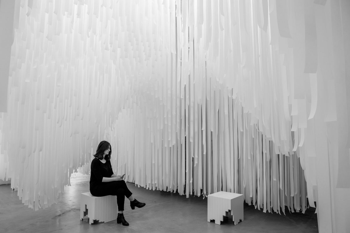
LIGHT CAVERN | Milan, Italy | 2015
Originally commissioned by COS for Salone del Mobile in Milan, Light Cavern is inspired by porosity and translucency. Created using 30,000 individual strips of perforated white fabric strips suspended from the ceiling, Light Cavern creates a series of cavernous volumes that visitors are invited to enter and explore. While the light-filled, ethereal environment creates a feeling of relaxation and contemplation, the softness of the material and density of the infilled areas also introduces a sense of play.
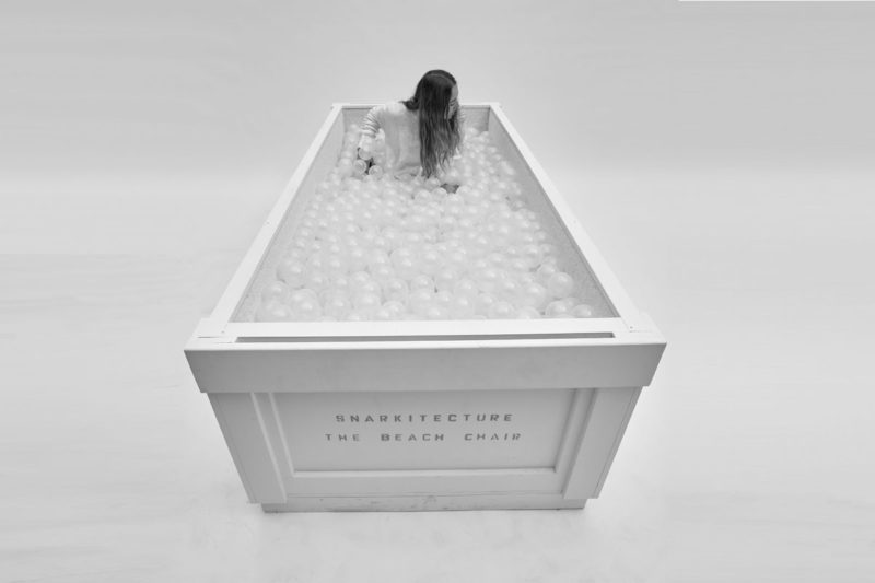
BEACH CHAIR | 2017
Beach Chair is a seating element inspired by Snarkitecture’s immersive interactive public installation The Beach. Scaled to a fraction of the original project size, Beach Chair invites people to relax or play while experiencing the sensation of moving or floating within the signature translucent balls that create the larger scale installation. Designed to be self-contained and easily shipped, the piece is modeled after an all-white art crate.
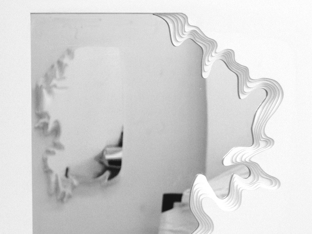
EXCAVATED MIRROR | 2010
A mirror created from a topographic landscape within the volume of a wall. Layered stacks are excavated from the architectural surroundings, revealing an unexpected perfectly mirrored surface within the thickness of the wall.
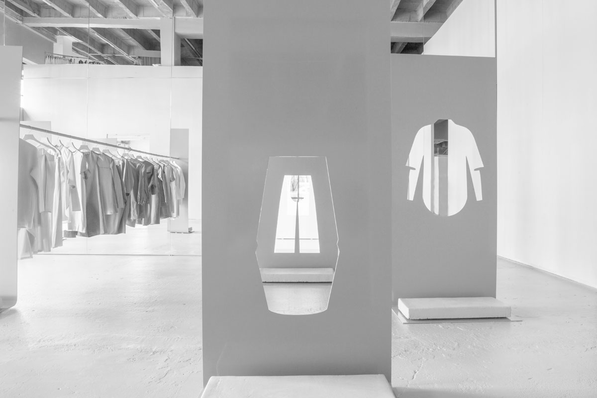
COS LA | Los Angeles, CA | 2015
Installed within the confines of a closet at Fun House, the original installation for COS explored the relationship between monochrome and reflection. A two-sided mirrored wall divided the space into two distinct environments: one all-white and the other entirely pink. Within each space, an identical grid of powder-coated steel displays featured silhouettes of the collection. The uncanny effect of finding oneself in two monochromatic, reflected spaces—identical yet different—creates an altered world.
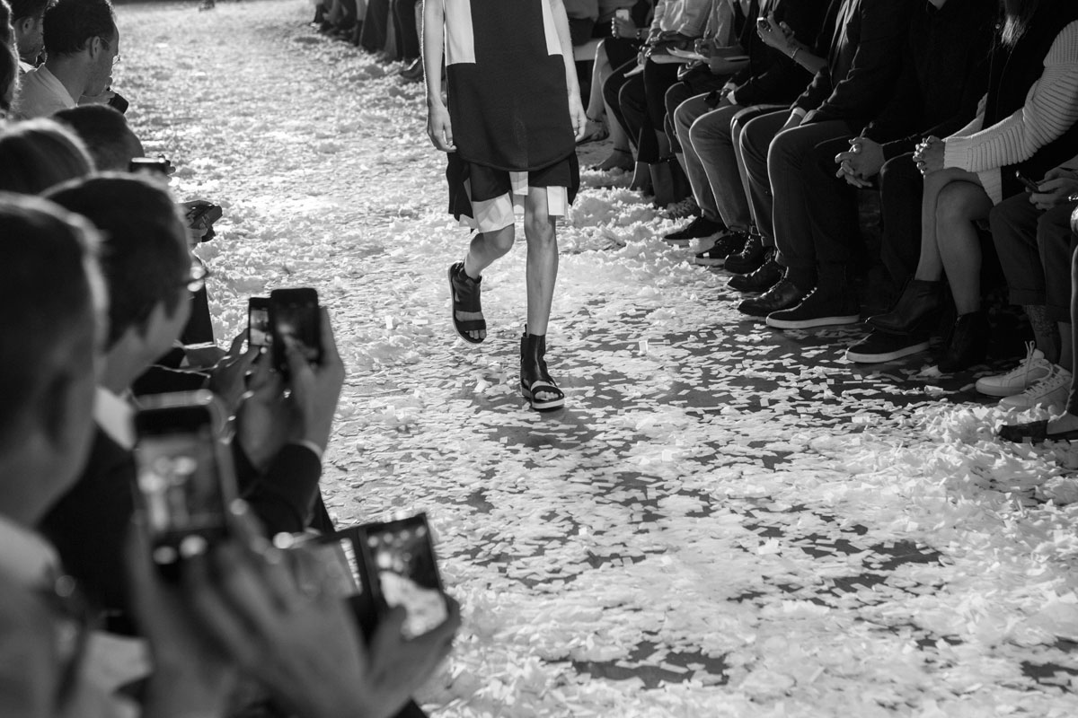
CONFETTI SHOW | New York, NY | 2015
Public School’s spring summer 2015 runway show featured two hundred pounds of white confetti arranged in a precise, grid-like pattern over the venue. As models walked the runway, the confetti was disrupted, dissolving into an evenly distributed plane of thick, white noise. The visual distortion echoes the intentional references to imperfection present in the collection, while also creating a celebratory environment. Within a closet in Fun House, the afterparty continues each time visitors open the door.
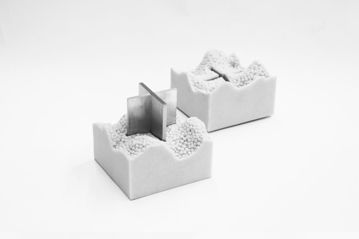
A+ AWARD | 2013
The A+ Award is a cube composed of two equal but opposite halves, cast from solid cultured marble. When separated, a concealed, textured landscape is revealed along with a black anodized aluminum plus sign with diamond tip engraving. The two halves of the award can be securely stacked in an open position for display by nesting the two plus signs on the exterior of the cube.
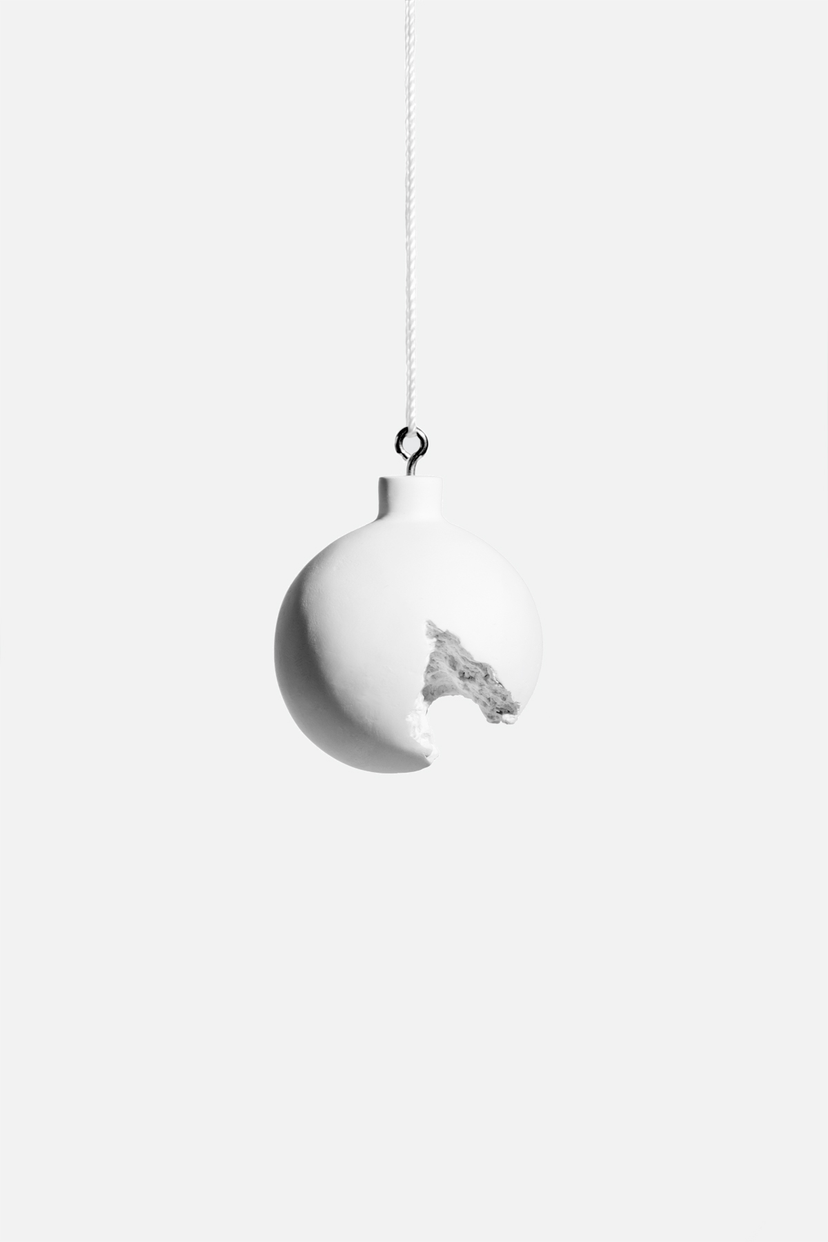
BROKEN ORNAMENT | 2012
Broken Ornament is a play on the traditional glass globe holiday ornament. Appearing from one side as a smooth sphere, from other angles the excavated form reveals the jagged texture of the interior. Recast in solid gypsum cement, the white material suggests a moment between ruin and construction, frozen in time.
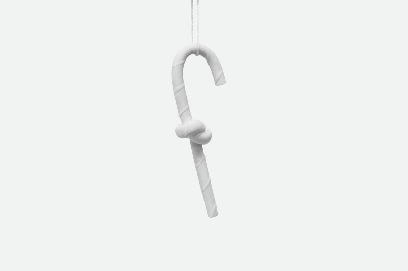
CANDY CANE ORNAMENT | 2015
The Candy Cane ornament is an abstracted interpretation of the classic holiday treat and sometimes ornament. Snarkitecture’s monochromatic version is cast from gypsum cement and unexpectedly knotted in the center while being inscribed throughout to replicate the familiar red stripes.
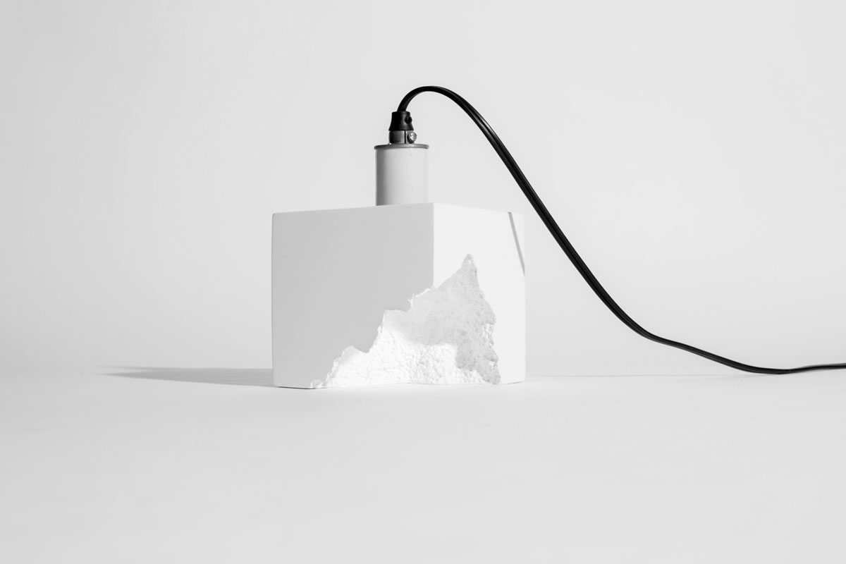
CAST LIGHT | 2011
Cast Light consists of a single long-life LED light bulb cast within a solid cubic volume of white gypsum cement. Hand formed and individually cast, each piece is a unique object. A single bulb can be used as a table lamp or accent light, while multiple bulbs can be arranged together to create a larger fixture.
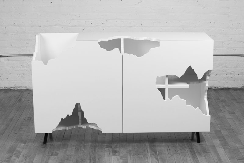
CUTAWAY CABINET | 2014
Based on a custom cabinet designed by Snarkitecture, the “cutaways” have been reinterpreted as an intervention in the kitchen cabinets of Fun House, revealing the contents displayed within. Similarly, the original millwork piece was commissioned as a functional piece to accommodate a vinyl record collection. The excavated form of the white lacquered cabinet offers storage, while partially revealing the contents of the owner’s collection.
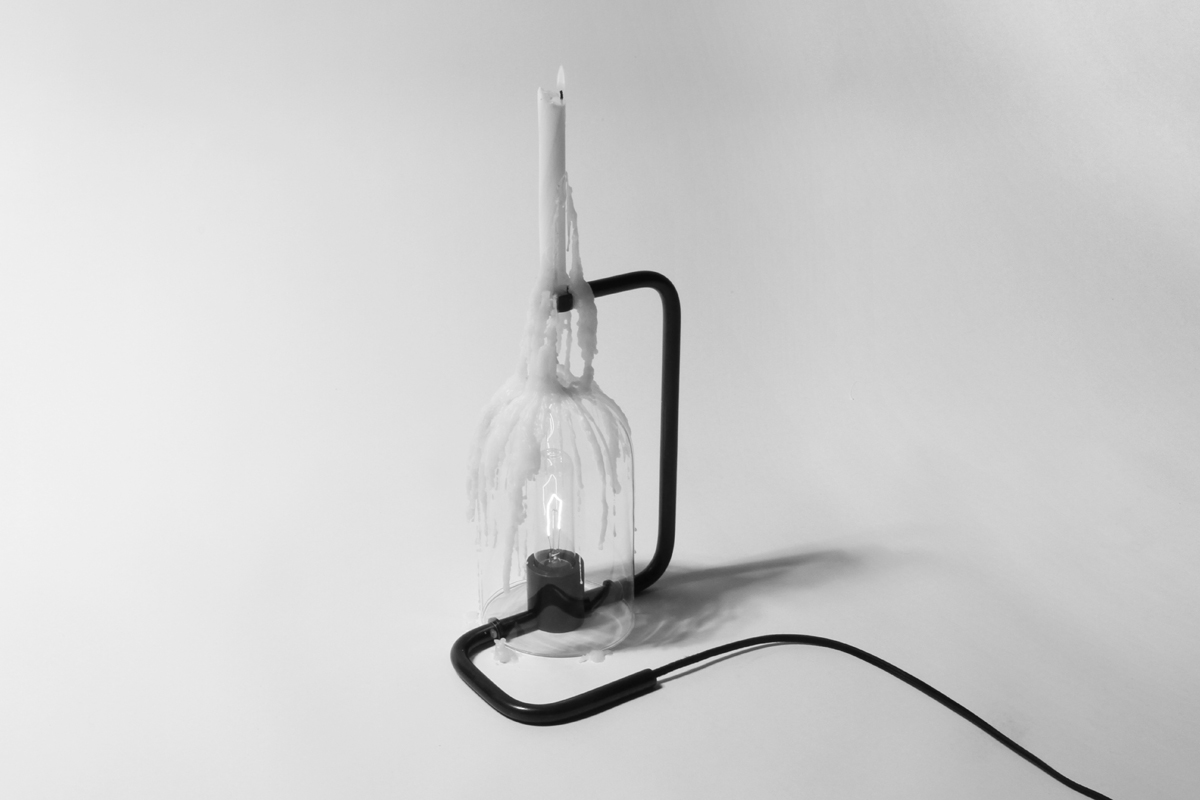
DRIP LIGHT | 2015
Drip Light is a candle holder and a light fixture. A candle is suspended above a glass dome containing a light bulb. As the candle burns down, the wax drips onto the glass below, slowly but continuously building successive layers of translucent wax. Over time, the quality of light emitted from the Drip Light shifts from transparently bright to a muted, luminous glow.
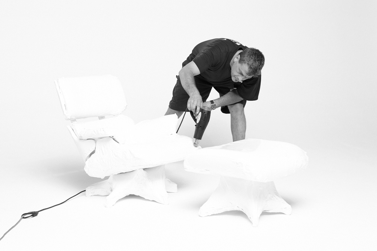
EAMES CHAIR | 2014
Snarkitecture was commissioned by Design Within Reach to reimagine the iconic Eames lounge chair and ottoman. The chair was wrapped with white, heavy duty shrink wrap. Applied with a flame torch, the film transformed the chair’s iconic materials and form. The wrapped Eames lounge is both recognizable and abstracted—a homogenous white mass that hints at the details underneath. A scale model of Snarkitecture’s interpretation of the lounge change is exhibited in the study.
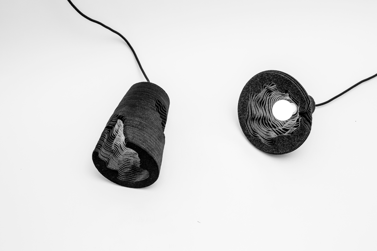
FELT LIGHT | 2013
Felt Light is made from stacked layers of thick wool felt, creating a form that recalls traditional pendant lighting. Whether suspended from a ceiling as a pendant fixture or resting on a surface as a table lamp, the underside of the piece reveals a hidden, excavated topography that plays against the careful, precise form of the exterior. Felt Light was initially commissioned by Wallpaper* Handmade, in collaboration with Woolmark.

OMBRE PLANE | Miami, FL | 2015
A scale model of the original project installed at the Miami airport during Art Basel, this installation reimagines the familiar yet remarkable sight of the sky at dawn or dusk. This phenomenon of the sky fading from light to dark is temporarily translated directly onto the exterior of a jet, as if the ombré was magically mapped onto the entire surface, creating a perfect gradient from a bluish white to a dark blue.
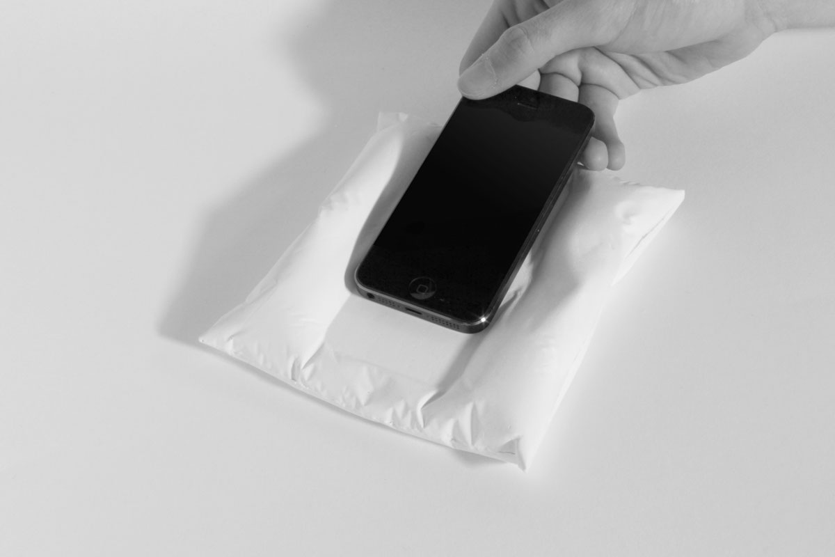
PILLOW | 2013
Pillow is designed to provide a dedicated and memorable resting place for your phone, keys, or other small objects. Appearing as a soft form molded by the weight of the object, the impression remains fixed when the phone is removed as the folds and indentations are cast from durable white gypsum cement.
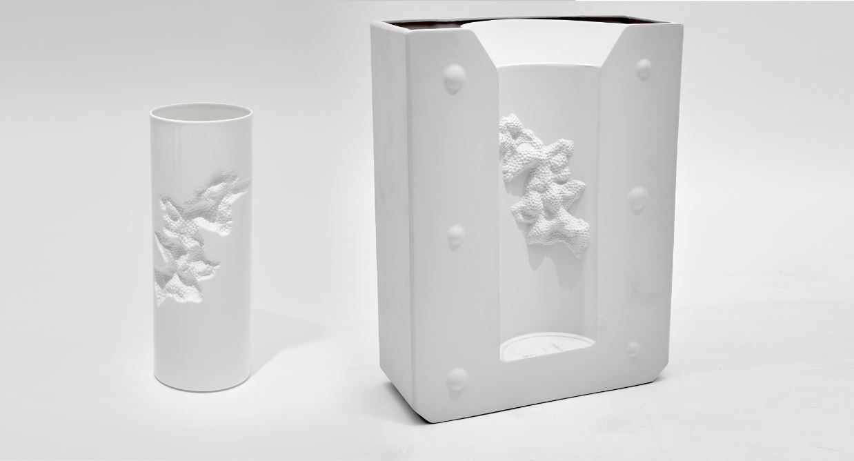
POSITIVE / NEGATIVE | 2017
This collaboration with 1882 Ltd. alludes to both the fragility and solidity of bone china, while revealing the technicalities involved in working with the material. A small volume is excavated from the side of Positive, leaving an irregular surface playing on the idea of a broken vase. Meanwhile, Negative is impressed with one half of its companion and references the mold that created it. Rendered in bone china, rather than the plaster or plywood typically used for a mold, Negative is given a new function as an open vessel.
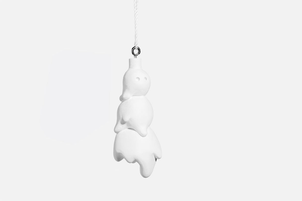
SNOWMAN ORNAMENT | 2014
Appearing suspended in a frozen moment, as if mid-melt, the Melting Snowman ornament is a humorous play on the iconic seasonal holiday image of the snowman.
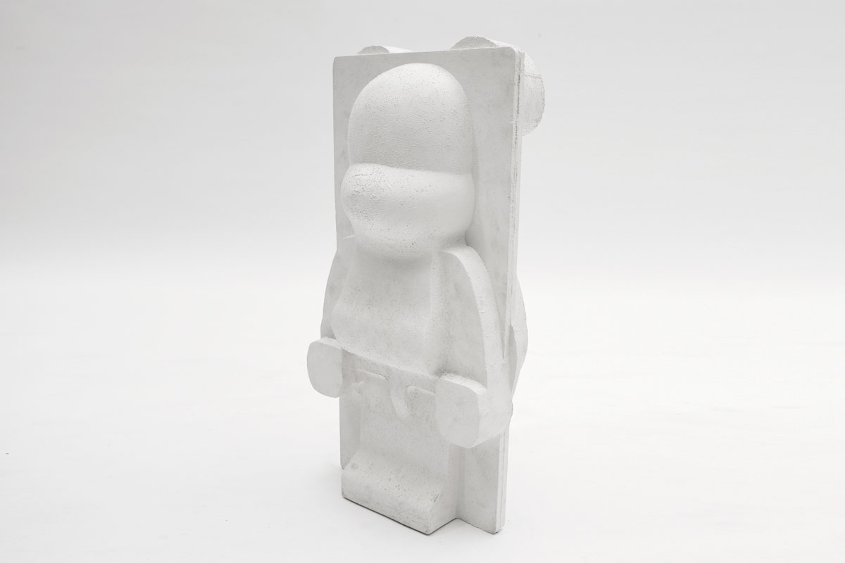
BEARBRICK | 2014
Commissioned by Japanese manufacturer Medicom, Bearbrick is created by casting the foam packaging that the collectible plastic Bearbrick toy ships in. By materializing the negative space of the packaging, a previously unseen, abstracted form of the Bearbrick is revealed. The resulting object has the same detail and texture as the EPS foam used in the packaging but with the solidity and weight of a solid mass cast from gypsum cement.
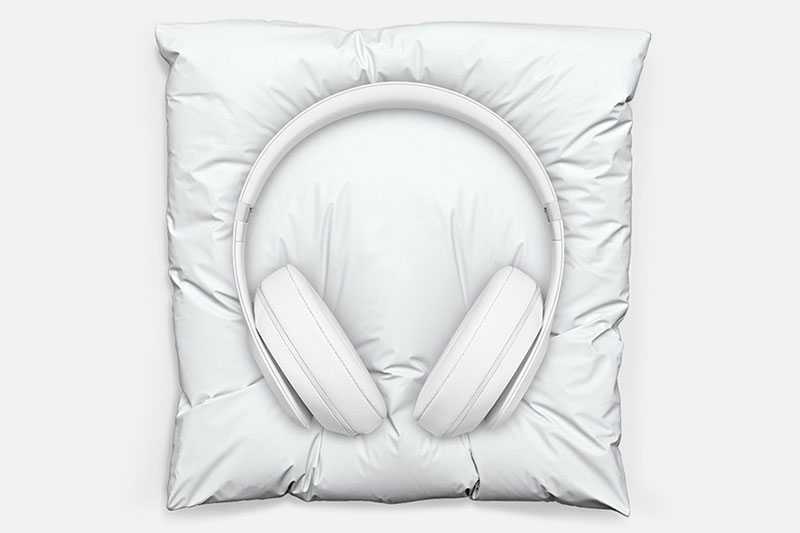
HEADPHONE PILLOW | 2014
The iconic Beats Studio headphones are reimagined as a monochromatic sculptural object. By removing the familiar colors and logos of Beats, the headphones are reduced to their purest form, resulting in an abstracted version that resembles a plaster model of the original. The accompanying pillow provides a resting place for the headphones. Appearing at first to be a soft form, the impression of the headphones remains fixed in the white cultured marble, creating a frozen moment.
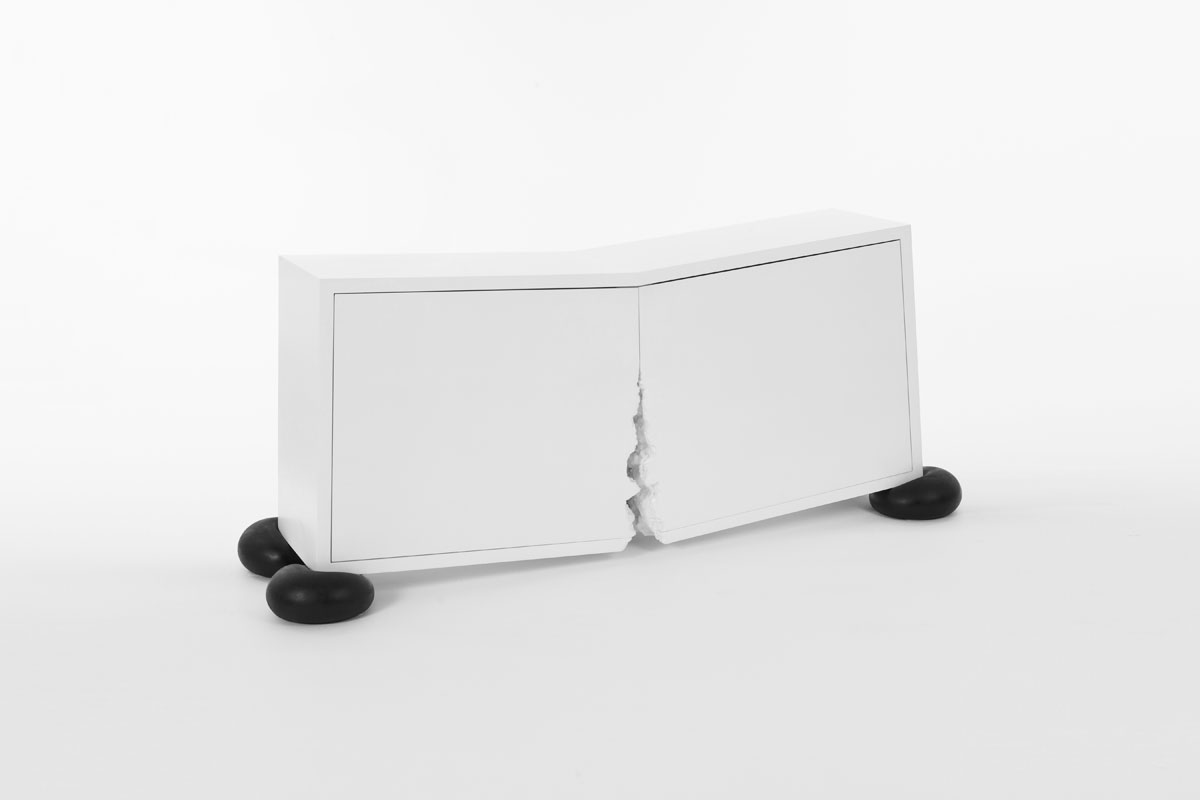
BREAK | 2012
Break is a cabinet that appears to be broken in half, yet is completely functional. Two ends rest on squashed black silicone feet whose resistance appear to crack the cabinet open at the center. The angle at which Break rests allows objects placed into it to remain at rest, acting as a functional bar or sideboard.
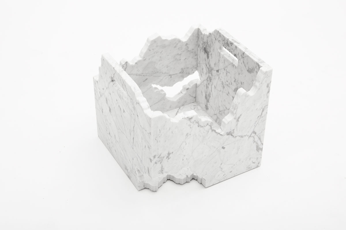
GHOSTLY CRATE | 2016
This limited edition record crate is a collaboration with the record label Ghostly International. Made from white Calacatta marble, the weight and richness of the stone transform the record crate from a lightweight means of storing and transporting vinyl into a striking and beautifully crafted heirloom piece. The excavated, cutaway forms reveal the albums held within, and along with the engraved logos, recall ruin and memorial, reimagining the crate as a reliquary for vinyl records.
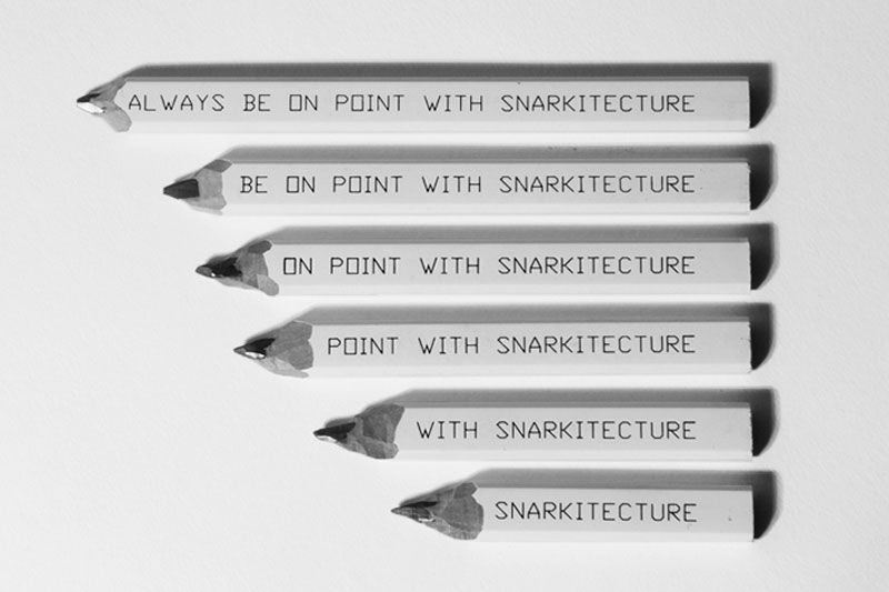
PENCIL | 2014
This carpenter’s pencil set takes on new meaning with each sharpening as the sentence is eventually erased in reverse.
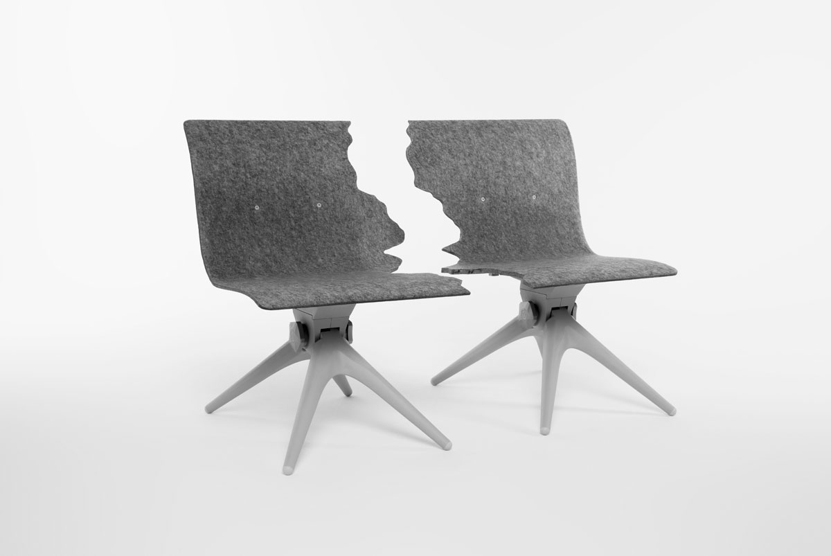
FRACTURED | 2018
In collaboration with Berlin-based brand Pentatonic, the Fractured collection is made entirely from post-consumer waste. Fractured plays on the themes of separation and modularity, in alignment with Pentatonic’s mission to recycle and repurpose existing materials. Fractured bench offers seating for two or may be easily separated into individual chairs. Similarly, the Fractured table can be split in two, and depending on the height of the base, functions as either a cocktail table or small dining table.
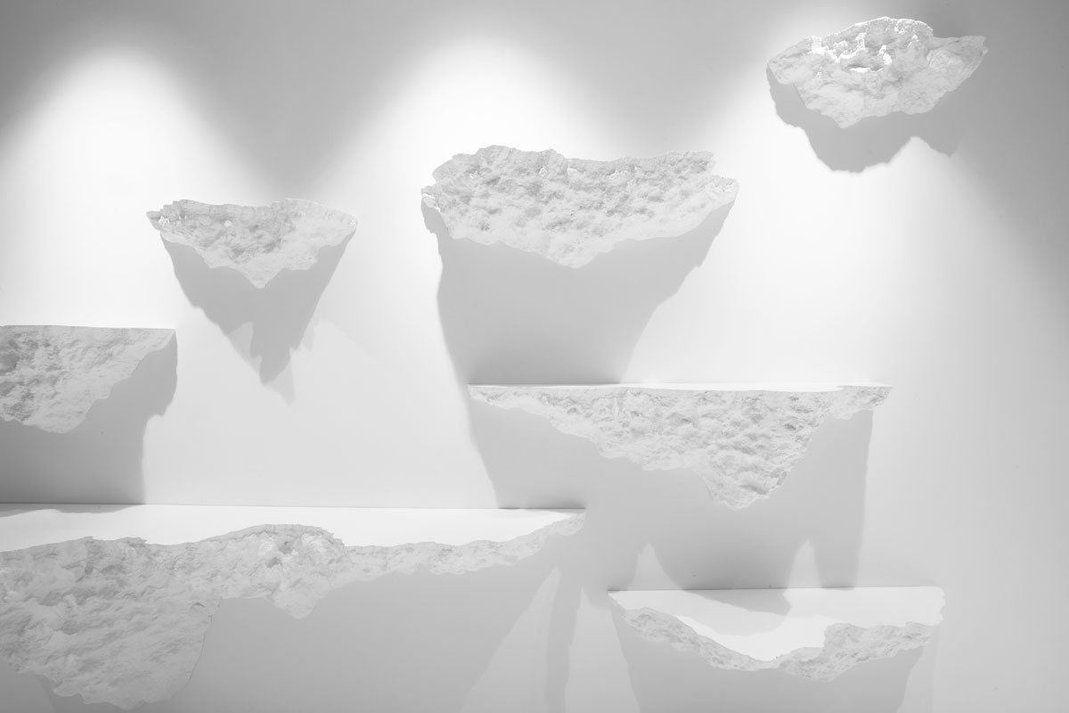
SHELVE | 2012
Shelve is an excavated slab cantilevered from a wall. The smooth top surface of the rectilinear volume extends outward before its sides dissolve into the textured form of the underside. Sloping down to the wall in ruin, this cragged landscape appears to merge into the wall’s surface, as though pulled from the earth below it. Shelve can be installed individually or in multiple to create a larger architectural installation.
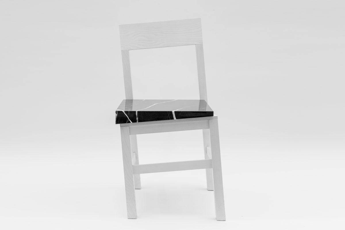
SLIP CHAIR | 2017
Handmade in Portugal by Uva, the white oak wood frame of Slip Chair appears to be sinking into the ground, rendering it unusable. However a tapered black marble stone slab restores a level, functional surface for sitting. The opposing elements of the light, wood frame and heavy, monolithic volume that rests upon it, exist in an oscillating balance. Rotated on two axes, the implied instability of the slipping form conceals the durability of Slip Chair.
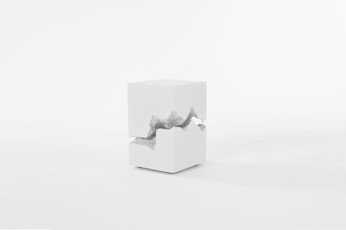
SPLIT | 2012
Split is an object made from the two broken halves of a single rectilinear volume. A deep, excavated crevasse reveals a rough interior landscape which stands in stark contrast to the smooth, marble exterior surface. Split was commissioned by Volume Gallery as part of a Snarkitecture-designed series exploring themes of precision versus looseness and instability.
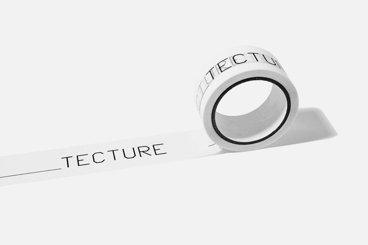
TAPE | 2014
Fill in the _______TECTURE. This packing tape is used in the studio for shipping purposes, or to apply to any surface to create your own architectural portmanteaus.
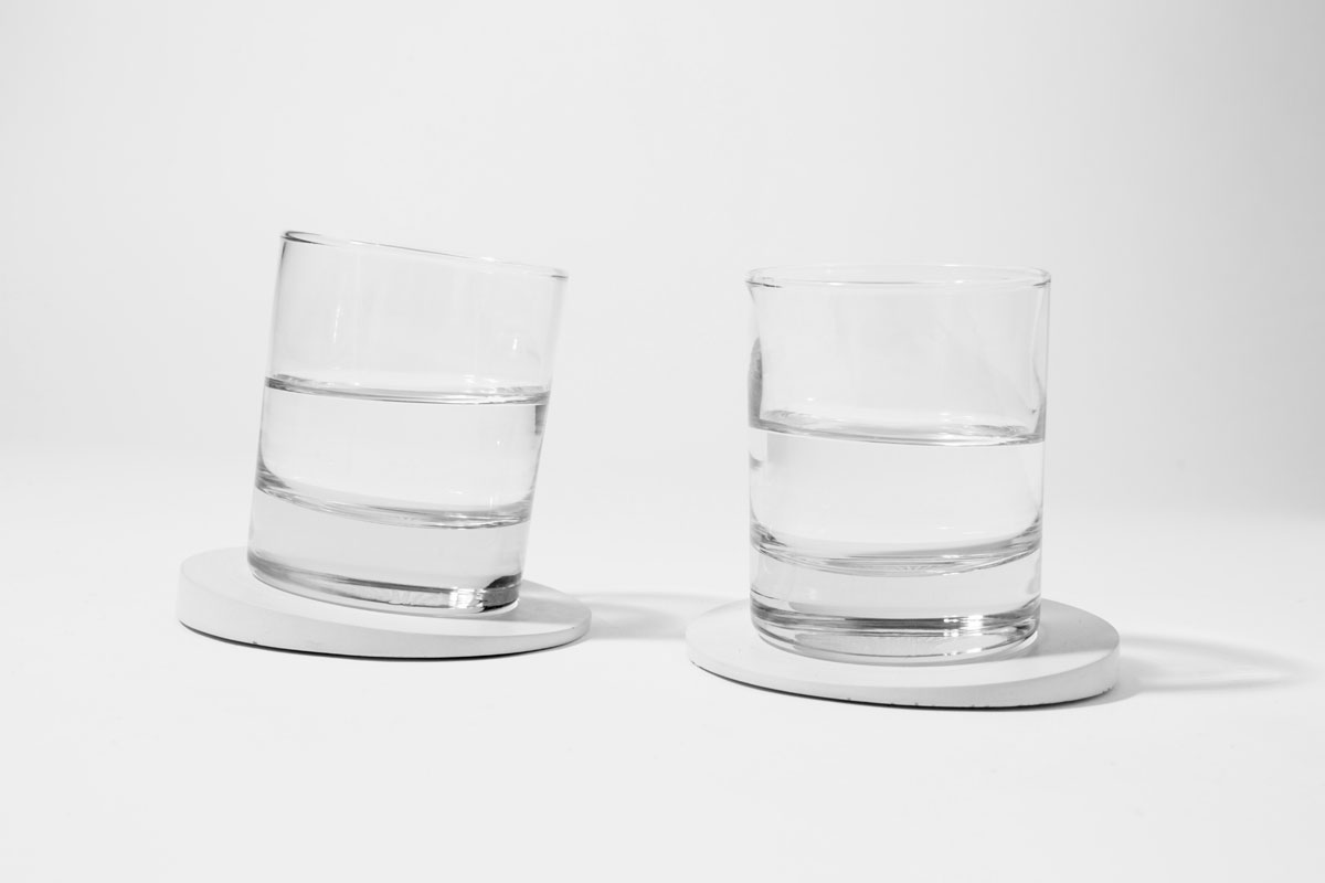
TILT COASTER | 2014
Appearing at first as a familiar round coaster, the angled top surface of Tilt Coaster is revealed when a drink is placed on it. A subtle ten degree angle holds your drink safely while creating a play between movement and stability. The pair of coasters can be angled towards each other to suggest a continual toast while holding your drinks and protecting your table.

TOPOGRAPHIES | 2017
The collaboration with Calico Wallpaper builds on Snarkitecture’s ongoing exploration of excavation. Topographies transforms this 3D exercise into a handmade 2D wallcovering. Sheets of paper were hand-torn and stacked, creating a stepped topography, and then scanned at a high resolution. The wallcovering implies an unknown architectural depth within the wall surface. Alluding to the aging process of layered wallpaper, Topographies reveals an unexpected relationship between destruction and construction.
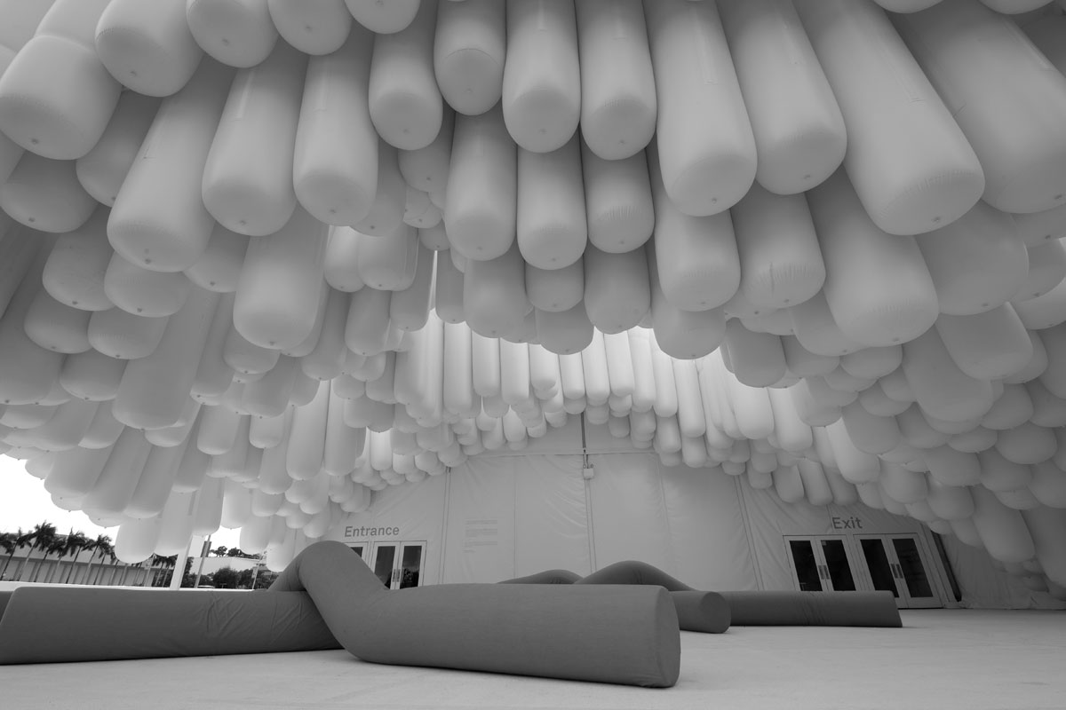
DRIFT | Miami, FL | 2012
The living room of Fun House is a reimagined version of Drift, the 2012 entrance pavilion for Design Miami. A play on the existing vinyl tent, the installation reformulates the material and creates a floating environment. Inflated tubes are bundled and form a topographical landscape in suspension: an ascending mountain above and an excavated cavern below. These long cylinders are arranged vertically to infill the overall area, and then lifted to produce areas of circulation and rest for visitors.
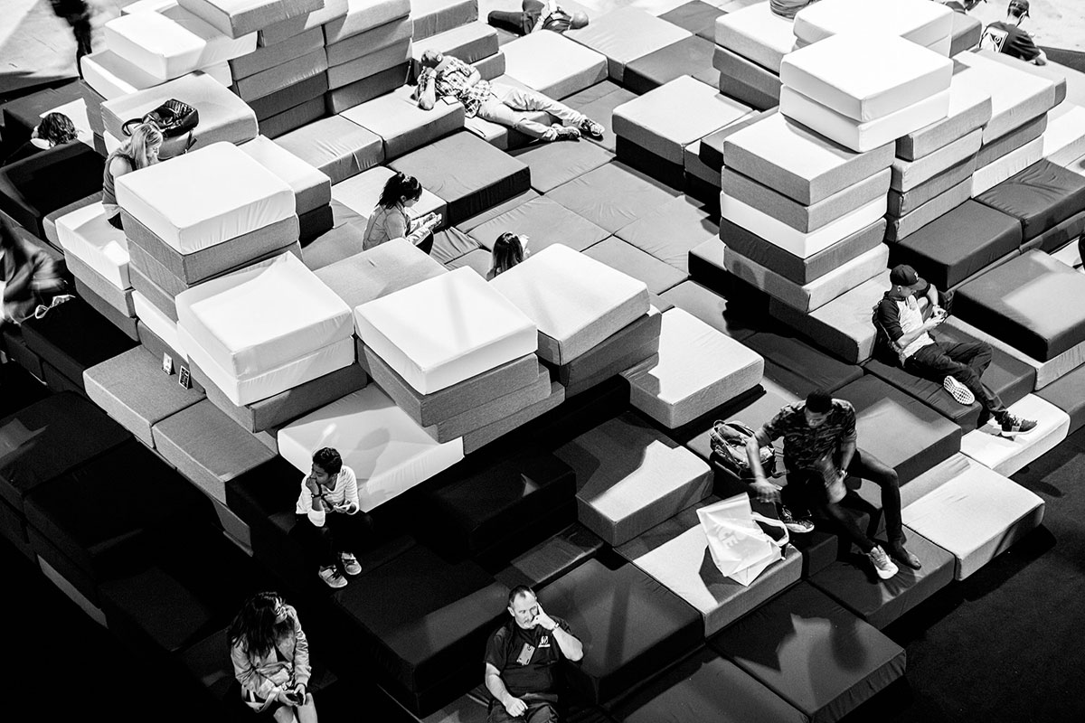
PILLOW FORT | Los Angeles, CA | 2016
Created as an environment for rest, relaxation, and socializing in the active context of ComplexCon, the original version of this installation featured three large mountainous configurations made from over 1,200 pillows. Presented here in the living room of Fun House as a single structure upholstered in a gradient of monochromatic greys, the flexible constructions harkens a child’s living room fort. The playful nature of Pillow Fort encourages engagement and participation from both adults and children alike.
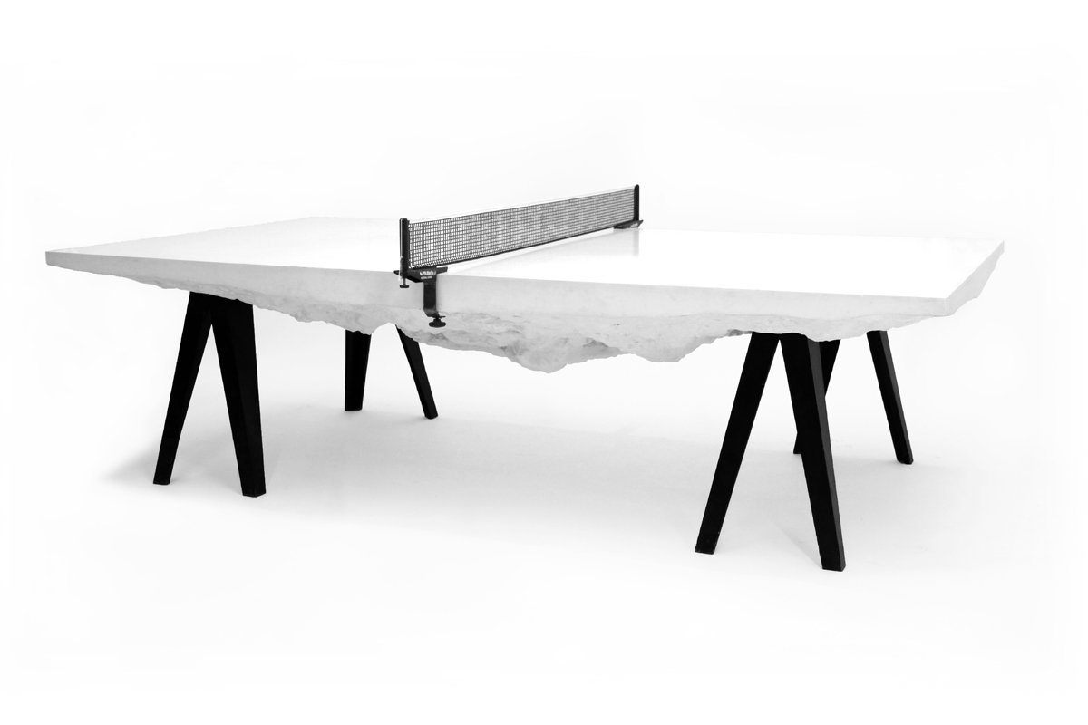
SLAB TABLE | 2010
Appearing from above as a rectangular volume, the carved sides hint at an inverted landscape concealed below. A single material is excavated to create a textured, topographic form suspended from the underside of a massive slab. Resting on tapered trestle legs, the slab is sized to the dimensions of a regulation table tennis surface. In addition to functioning as a surface for play, the piece can also be used as a surface for work or dining.
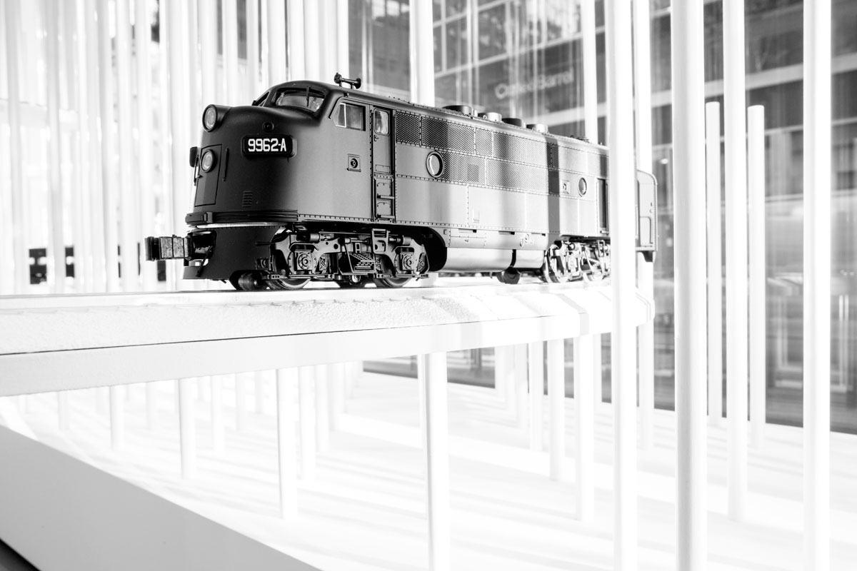
TRAINSCAPE | New York, NY | 2014
Originally commissioned as a holiday window display for the Calvin Klein flagship store, Trainscape reimagines and abstracts traditional holiday scenery. An all-white landscape, alluding to a snow drift, infilled the windows, while a series of custom model trains circulated through the windows and surrounding topography in an mesmerizing play of being revealed and concealed to pedestrians. In the context of the Fun House study, the train completes an endless loop connecting interior and exterior.
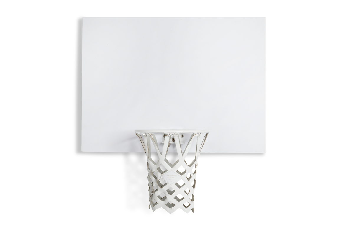
MINI BASKETBALL HOOP | 2015
Made in collaboration with Los Angeles-based brand KILLSPENCER, thecollector’s edition mini basketball hoop is created in all white. he hoop features a gloss white breakaway rim, mounted on a durable white melamine laminate backboard, a white leather net and springs, and silver hardware.
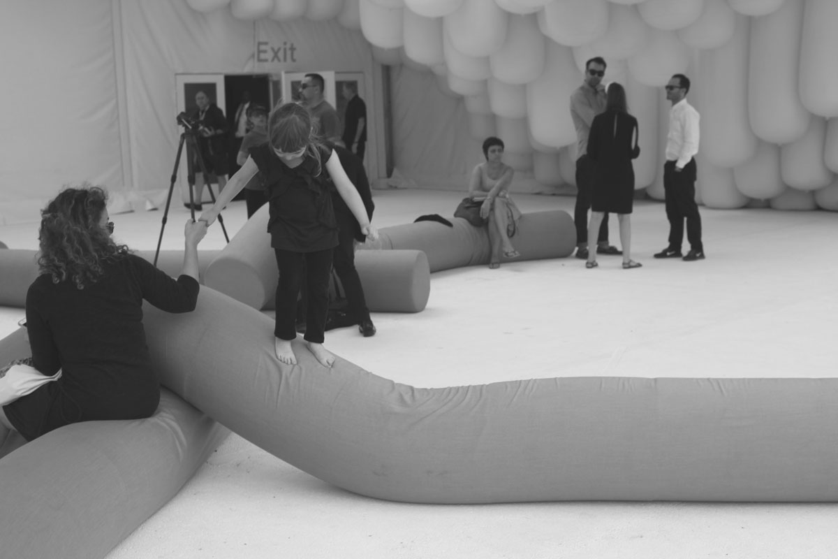
BEND | 2012
Bend is a series of upholstered foam elements that bend, twist and drape over one another to create a reconfigurable seating environment. Inhabiting a world between collapse and animation, the elongated cylindrical forms create a shifting landscape for play and relaxation. Bend was originally presented as a site-specific outdoor installation for the entrance courtyard of Design Miami/ 2012, playing off of the inflatable tubes of Snarkitecture’s Drift pavilion.
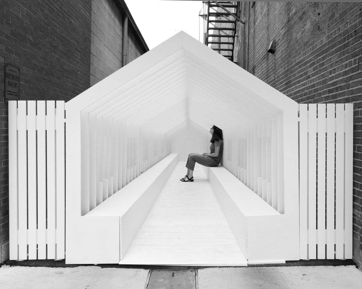
PLAYHOUSE | Columbus, IN | 2017
Playhouse was originally commissioned as a site-specific installation for Exhibit Columbus. The concept starts with the premise that most architecture is designed for the scale of adults but is often reinterpreted by children for imaginative purposes. Playhouse is designed to highlight the discrepancy between how adults and children experience and respond to scale and proportion. Using forced perspective to create the illusion of an unexpected depth, the structure creates a link between these two worlds.
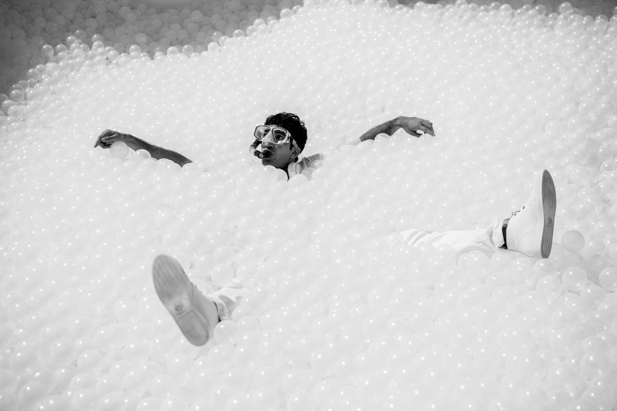
THE BEACH | Multiple Locations | 2015-Ongoing
The BEACH is an interactive installation originally commissioned by National Building Museum in 2015. For Fun House, the immersive environment has been reimagined as a classic backyard swimming pool, only made from the all-white materials of The BEACH. Taking cues from the familiar experience of a summer day, and transforming both the natural and cultural elements of these spaces, creates an unexpected and memorable experience that welcomes visitors of all ages to explore, play, and relax.
